1
2
3
4
5
6
7
8
9
10
11
12
13
14
15
16
17
18
19
20
21
22
23
24
25
26
27
28
29
30
31
32
33
34
35
36
37
38
39
40
41
42
43
44
45
46
47
48
49
50
51
52
53
54
55
56
57
58
59
60
61
62
63
64
65
66
67
68
69
70
71
72
73
74
75
76
77
78
79
80
81
82
83
84
85
86
87
88
89
90
91
92
93
94
95
96
97
98
99
100
101
102
103
104
105
106
107
108
109
110
111
112
113
114
115
116
117
118
119
120
121
122
123
124
125
126
127
128
129
130
131
132
133
134
135
136
137
138
139
140
141
142
143
144
145
146
147
148
149
150
151
152
153
154
155
156
157
158
159
160
161
162
163
164
165
166
167
168
169
170
171
172
173
174
175
176
177
178
179
180
181
182
183
184
185
186
187
188
189
190
191
192
193
194
195
196
197
198
199
200
201
202
203
204
205
206
207
208
209
210
211
212
213
214
215
216
217
218
219
220
221
222
223
224
225
226
227
228
229
230
231
232
233
234
235
236
237
238
239
240
241
242
243
244
245
|
# TensorBoard Histogram Dashboard
The TensorBoard Histogram Dashboard displays how the distribution of some
`Tensor` in your TensorFlow graph has changed over time. It does this by showing
many histograms visualizations of your tensor at different points in time.
## A Basic Example
Let's start with a simple case: a normally-distributed variable, where the mean
shifts over time.
TensorFlow has an op
[`tf.random_normal`](https://www.tensorflow.org/api_docs/python/tf/random_normal)
which is perfect for this purpose. As is usually the case with TensorBoard, we
will ingest data using a summary op; in this case,
['tf.summary.histogram'](https://www.tensorflow.org/api_docs/python/tf/summary/histogram).
For a primer on how summaries work, please see the
[TensorBoard guide](./summaries_and_tensorboard.md).
Here is a code snippet that will generate some histogram summaries containing
normally distributed data, where the mean of the distribution increases over
time.
```python
import tensorflow as tf
k = tf.placeholder(tf.float32)
# Make a normal distribution, with a shifting mean
mean_moving_normal = tf.random_normal(shape=[1000], mean=(5*k), stddev=1)
# Record that distribution into a histogram summary
tf.summary.histogram("normal/moving_mean", mean_moving_normal)
# Setup a session and summary writer
sess = tf.Session()
writer = tf.summary.FileWriter("/tmp/histogram_example")
summaries = tf.summary.merge_all()
# Setup a loop and write the summaries to disk
N = 400
for step in range(N):
k_val = step/float(N)
summ = sess.run(summaries, feed_dict={k: k_val})
writer.add_summary(summ, global_step=step)
```
Once that code runs, we can load the data into TensorBoard via the command line:
```sh
tensorboard --logdir=/tmp/histogram_example
```
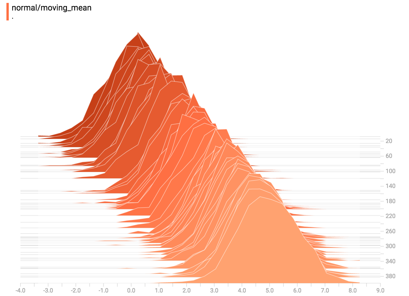
Once TensorBoard is running, load it in Chrome or Firefox and navigate to the
Histogram Dashboard. Then we can see a histogram visualization for our normally
distributed data.
`tf.summary.histogram` takes an arbitrarily sized and shaped Tensor, and
compresses it into a histogram data structure consisting of many bins with
widths and counts. For example, let's say we want to organize the numbers
`[0.5, 1.1, 1.3, 2.2, 2.9, 2.99]` into bins. We could make three bins:
* a bin
containing everything from 0 to 1 (it would contain one element, 0.5),
* a bin
containing everything from 1-2 (it would contain two elements, 1.1 and 1.3),
* a bin containing everything from 2-3 (it would contain three elements: 2.2,
2.9 and 2.99).
TensorFlow uses a similar approach to create bins, but unlike in our example, it
doesn't create integer bins. For large, sparse datasets, that might result in
many thousands of bins.
Instead, [the bins are exponentially distributed, with many bins close to 0 and
comparatively few bins for very large numbers.](https://github.com/tensorflow/tensorflow/blob/c8b59c046895fa5b6d79f73e0b5817330fcfbfc1/tensorflow/core/lib/histogram/histogram.cc#L28)
However, visualizing exponentially-distributed bins is tricky; if height is used
to encode count, then wider bins take more space, even if they have the same
number of elements. Conversely, encoding count in the area makes height
comparisons impossible. Instead, the histograms [resample the data](https://github.com/tensorflow/tensorflow/blob/17c47804b86e340203d451125a721310033710f1/tensorflow/tensorboard/components/tf_backend/backend.ts#L400)
into uniform bins. This can lead to unfortunate artifacts in some cases.
Each slice in the histogram visualizer displays a single histogram.
The slices are organized by step;
older slices (e.g. step 0) are further "back" and darker, while newer slices
(e.g. step 400) are close to the foreground, and lighter in color.
The y-axis on the right shows the step number.
You can mouse over the histogram to see tooltips with some more detailed
information. For example, in the following image we can see that the histogram
at timestep 176 has a bin centered at 2.25 with 177 elements in that bin.
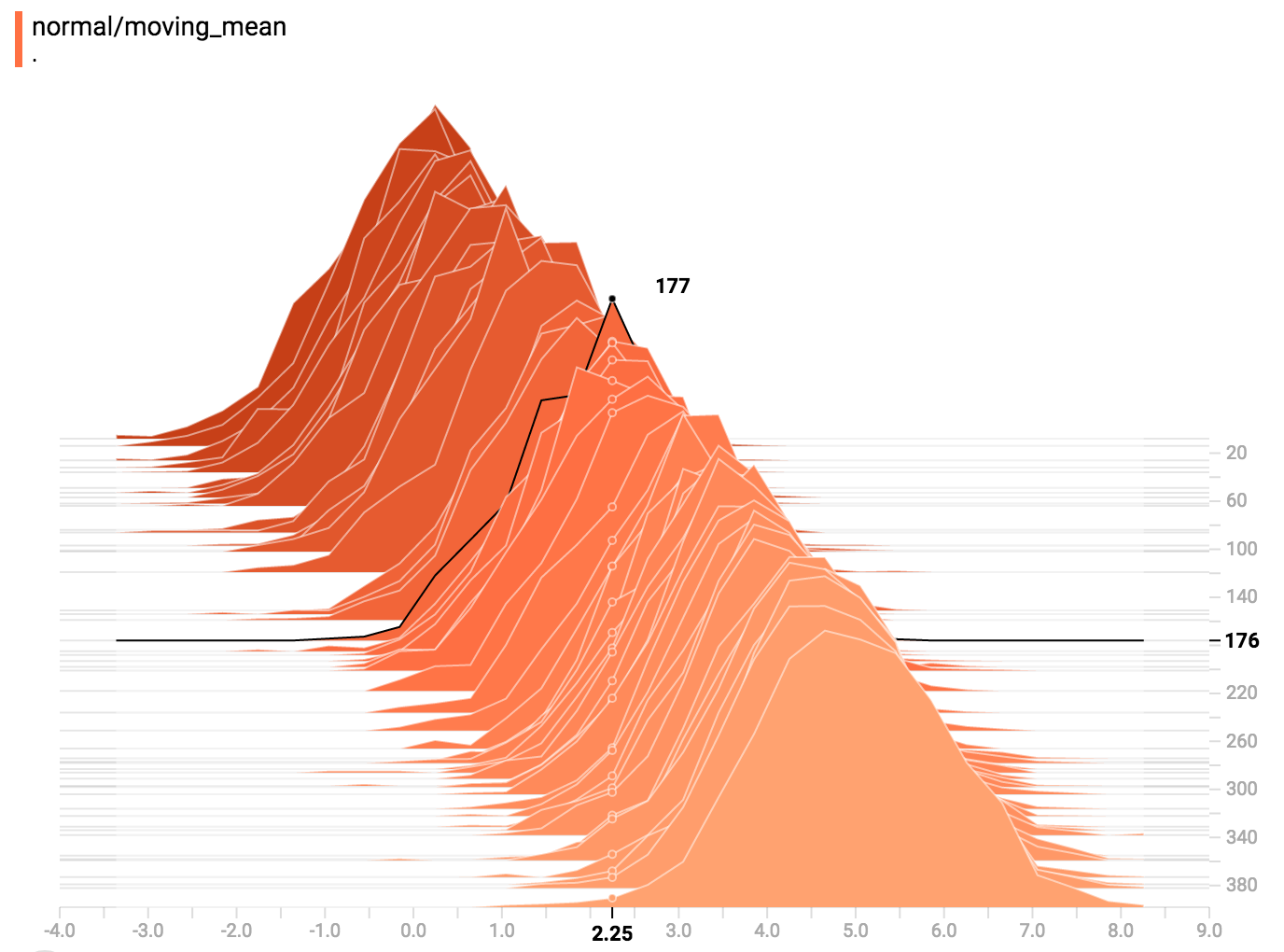
Also, you may note that the histogram slices are not always evenly spaced in
step count or time. This is because TensorBoard uses
[reservoir sampling](https://en.wikipedia.org/wiki/Reservoir_sampling) to keep a
subset of all the histograms, to save on memory. Reservoir sampling guarantees
that every sample has an equal likelihood of being included, but because it is
a randomized algorithm, the samples chosen don't occur at even steps.
## Overlay Mode
There is a control on the left of the dashboard that allows you to toggle the
histogram mode from "offset" to "overlay":
In "offset" mode, the visualization rotates 45 degrees, so that the individual
histogram slices are no longer spread out in time, but instead are all plotted
on the same y-axis.
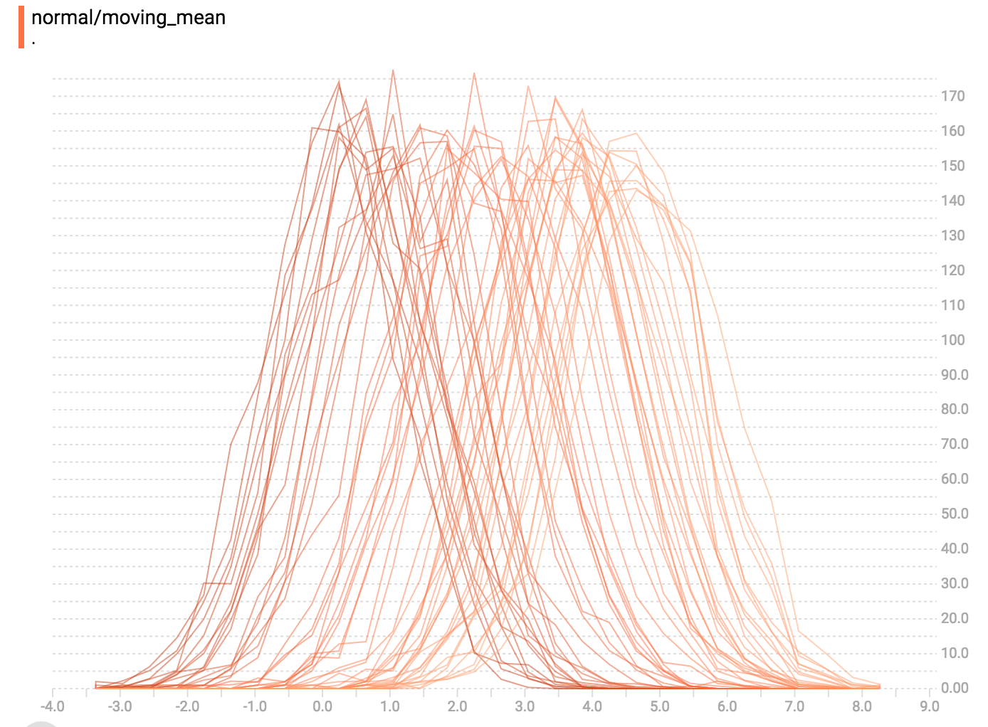
Now, each slice is a separate line on the chart, and the y-axis shows the item
count within each bucket. Darker lines are older, earlier steps, and lighter
lines are more recent, later steps. Once again, you can mouse over the chart to
see some additional information.
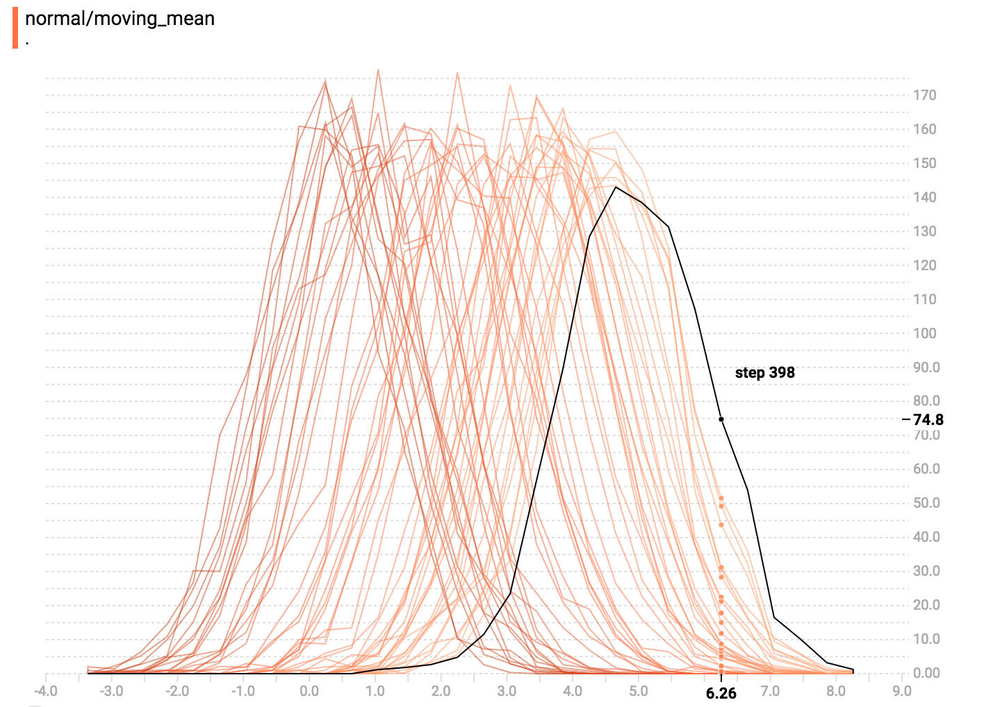
In general, the overlay visualization is useful if you want to directly compare
the counts of different histograms.
## Multimodal Distributions
The Histogram Dashboard is great for visualizing multimodal
distributions. Let's construct a simple bimodal distribution by concatenating
the outputs from two different normal distributions. The code will look like
this:
```python
import tensorflow as tf
k = tf.placeholder(tf.float32)
# Make a normal distribution, with a shifting mean
mean_moving_normal = tf.random_normal(shape=[1000], mean=(5*k), stddev=1)
# Record that distribution into a histogram summary
tf.summary.histogram("normal/moving_mean", mean_moving_normal)
# Make a normal distribution with shrinking variance
variance_shrinking_normal = tf.random_normal(shape=[1000], mean=0, stddev=1-(k))
# Record that distribution too
tf.summary.histogram("normal/shrinking_variance", variance_shrinking_normal)
# Let's combine both of those distributions into one dataset
normal_combined = tf.concat([mean_moving_normal, variance_shrinking_normal], 0)
# We add another histogram summary to record the combined distribution
tf.summary.histogram("normal/bimodal", normal_combined)
summaries = tf.summary.merge_all()
# Setup a session and summary writer
sess = tf.Session()
writer = tf.summary.FileWriter("/tmp/histogram_example")
# Setup a loop and write the summaries to disk
N = 400
for step in range(N):
k_val = step/float(N)
summ = sess.run(summaries, feed_dict={k: k_val})
writer.add_summary(summ, global_step=step)
```
You already remember our "moving mean" normal distribution from the example
above. Now we also have a "shrinking variance" distribution. Side-by-side, they
look like this:
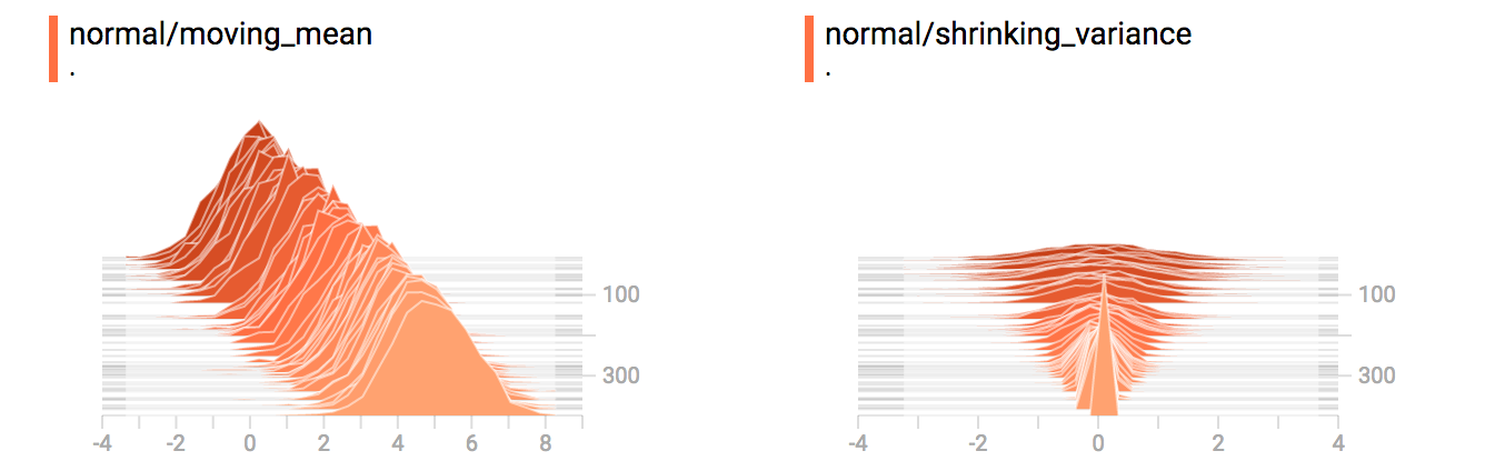
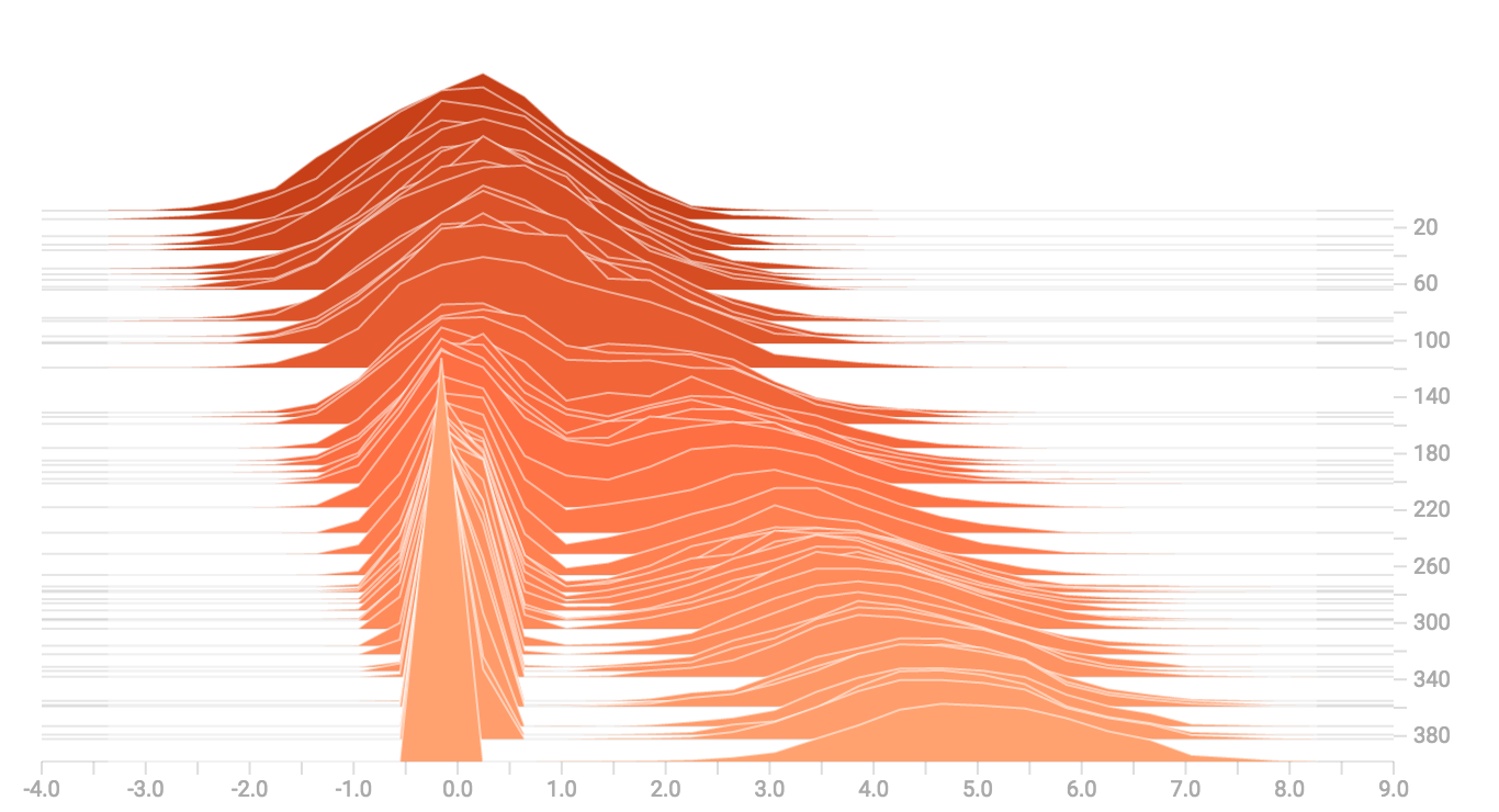
When we concatenate them, we get a chart that clearly reveals the divergent,
bimodal structure:
## Some more distributions
Just for fun, let's generate and visualize a few more distributions, and then
combine them all into one chart. Here's the code we'll use:
```python
import tensorflow as tf
k = tf.placeholder(tf.float32)
# Make a normal distribution, with a shifting mean
mean_moving_normal = tf.random_normal(shape=[1000], mean=(5*k), stddev=1)
# Record that distribution into a histogram summary
tf.summary.histogram("normal/moving_mean", mean_moving_normal)
# Make a normal distribution with shrinking variance
variance_shrinking_normal = tf.random_normal(shape=[1000], mean=0, stddev=1-(k))
# Record that distribution too
tf.summary.histogram("normal/shrinking_variance", variance_shrinking_normal)
# Let's combine both of those distributions into one dataset
normal_combined = tf.concat([mean_moving_normal, variance_shrinking_normal], 0)
# We add another histogram summary to record the combined distribution
tf.summary.histogram("normal/bimodal", normal_combined)
# Add a gamma distribution
gamma = tf.random_gamma(shape=[1000], alpha=k)
tf.summary.histogram("gamma", gamma)
# And a poisson distribution
poisson = tf.random_poisson(shape=[1000], lam=k)
tf.summary.histogram("poisson", poisson)
# And a uniform distribution
uniform = tf.random_uniform(shape=[1000], maxval=k*10)
tf.summary.histogram("uniform", uniform)
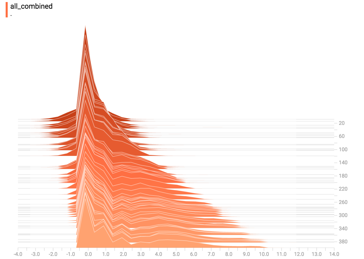
# Finally, combine everything together!
all_distributions = [mean_moving_normal, variance_shrinking_normal,
gamma, poisson, uniform]
all_combined = tf.concat(all_distributions, 0)
tf.summary.histogram("all_combined", all_combined)
summaries = tf.summary.merge_all()
# Setup a session and summary writer
sess = tf.Session()
writer = tf.summary.FileWriter("/tmp/histogram_example")
# Setup a loop and write the summaries to disk
N = 400
for step in range(N):
k_val = step/float(N)
summ = sess.run(summaries, feed_dict={k: k_val})
writer.add_summary(summ, global_step=step)
```
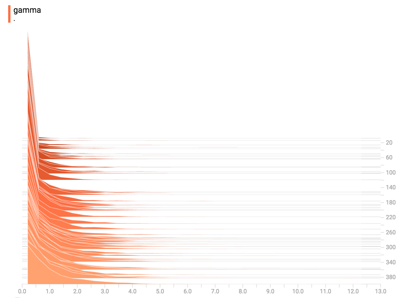
### Gamma Distribution
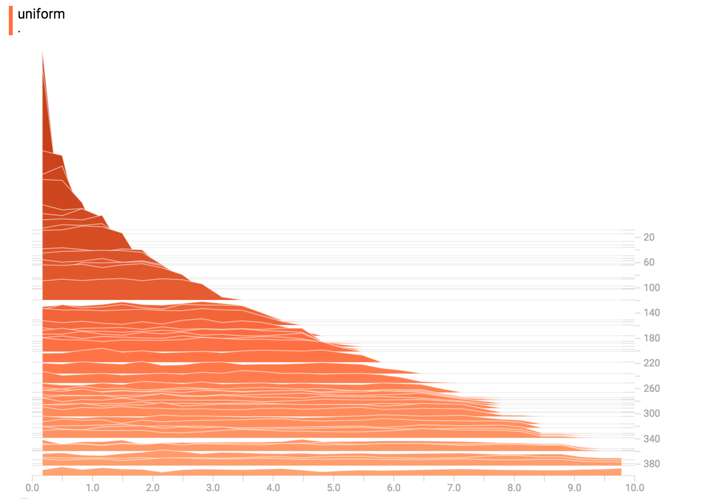
### Uniform Distribution
### Poisson Distribution
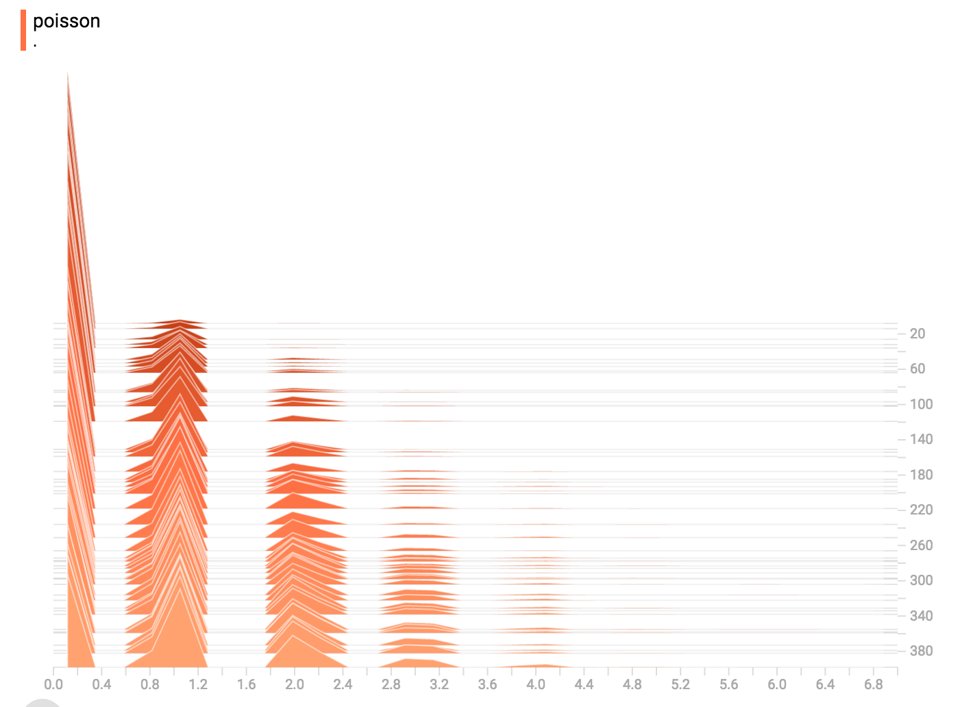
The poisson distribution is defined over the integers. So, all of the values
being generated are perfect integers. The histogram compression moves the data
into floating-point bins, causing the visualization to show little
bumps over the integer values rather than perfect spikes.
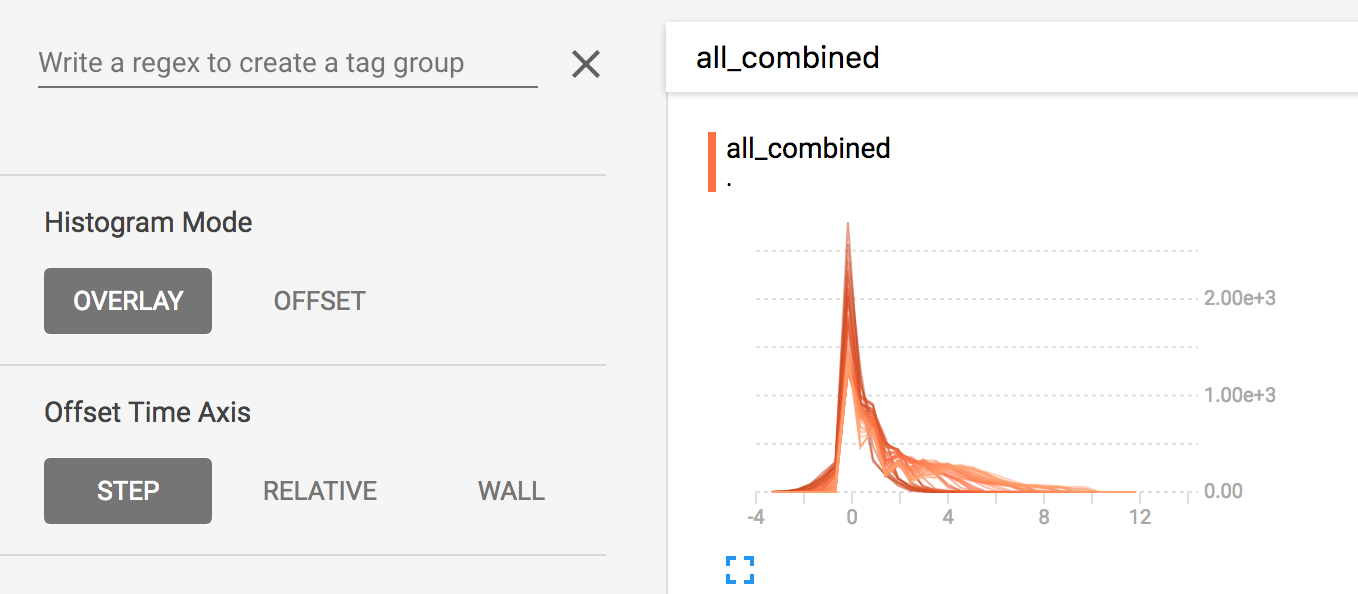
### All Together Now
Finally, we can concatenate all of the data into one funny-looking curve.
|
